Case Study Details Page
Welcome to my Case Study!
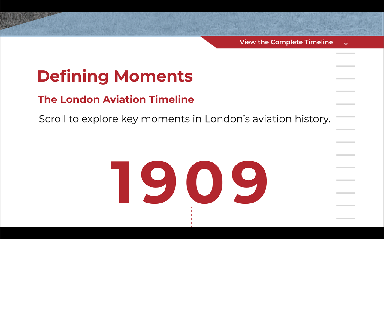
Case Study: Parallax Timeline
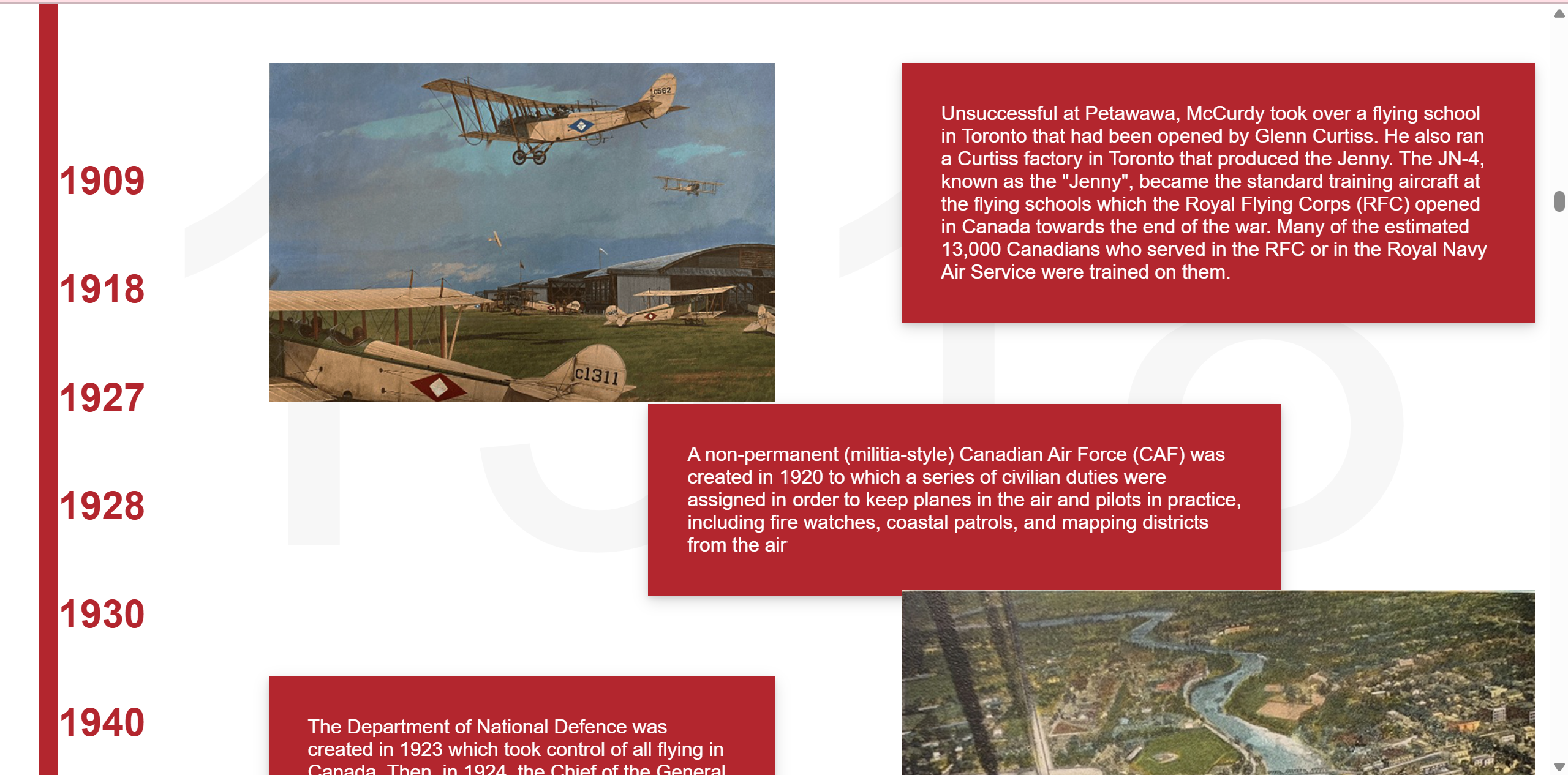
This case study examines how to I improved our timeline design and functionality from a boring show/hide function to a scrolling parallax timeline that improves engagement and visual interest.
This case study was based on this website's idea: https://www.sbs.com.au/theboat/
I picked this reference because I was fascinated with the way this website integrates the parallax effect to enhance the purpose of website. I find much admiration in their creative decision to make the digital experience feel like something corporeal and physical.
The end result of my creative efforts allowed me to understand one of the fundamental pillars of CSS styling. Being able to create, control, and visualize in a custom-made grid system has opened new doors to my pathway as a front-end developer. Previously, I felt constrained in my creative efforts and I felt like I had to adhere and work around the limitations of the advised grid.css. However, because of this exploration, I am able to better control and visualize more complex and enriching designs for various web purposes.
The problem that I was running into in the first iteration of the timeline was how boring and flat the functionality of the web page felt. I felt that this simplicity somehow betrays the intrigue and depth of the museum's history. In my opinion, I think it is highly unrealistic to expect the majority of users to willingly sift through a dense block of text. Furthermore, I also think that if the interactivity of timeline involves clicking a button to reveal even more text. I think this a failure of a action/reward system for the user and I think it actively discourages users to want to learn more about the museum's history.
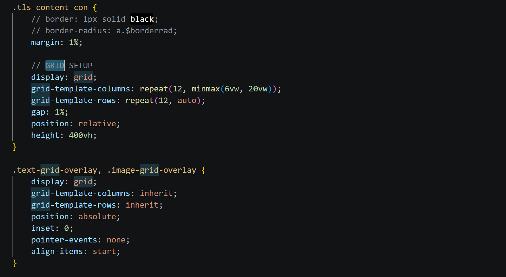
The solution I arrived at was to make the interaction of the website be the vehicle that allows users to learn more about history. This is an idea taken very directly from the reference website of "The Boat". On that website, they manage to maximize the usability of the website to seamlessly compliment the purpose of it. So my goal was to achieve the same creative maximizations. However, this meant that I had to overcome various struggles that required me to overcome the styling foundations that I was taught in College. I was taught to adhere to a grid.css file that has a pre-built grid system to easily attach styling to responsively. This is a great tool that catches non-programmers up to speed with a solid and professional standard of web interaction. However, I found that this system was actively disrupting the possibilities of having my parallax operate freely and creatively. This build helped me get out of my comfort zone and abandon the training wheels that we were taught to explore the freedom of defining my own grids that I can control at will. This also allowed me to inherit multiple elements to the same grid that allowed for layering effects for my parallax effects and has since allowed me explore creative liberties that were once hindered by my training wheels.